

The Fish Guy | Hospitality Rebrand
The freshest catch? We know a guy.
The Fish Guy has been a Chicago fish market for over 30 years—trusted by some of the city’s best restaurateurs. But after that much time, it’s easy for things to slip. Freshness fades. Branding gets forgotten.
With new ownership came a clear mission: throw out what wasn’t working, invest in what mattered. The question was—what parts of the old identity were worth keeping?
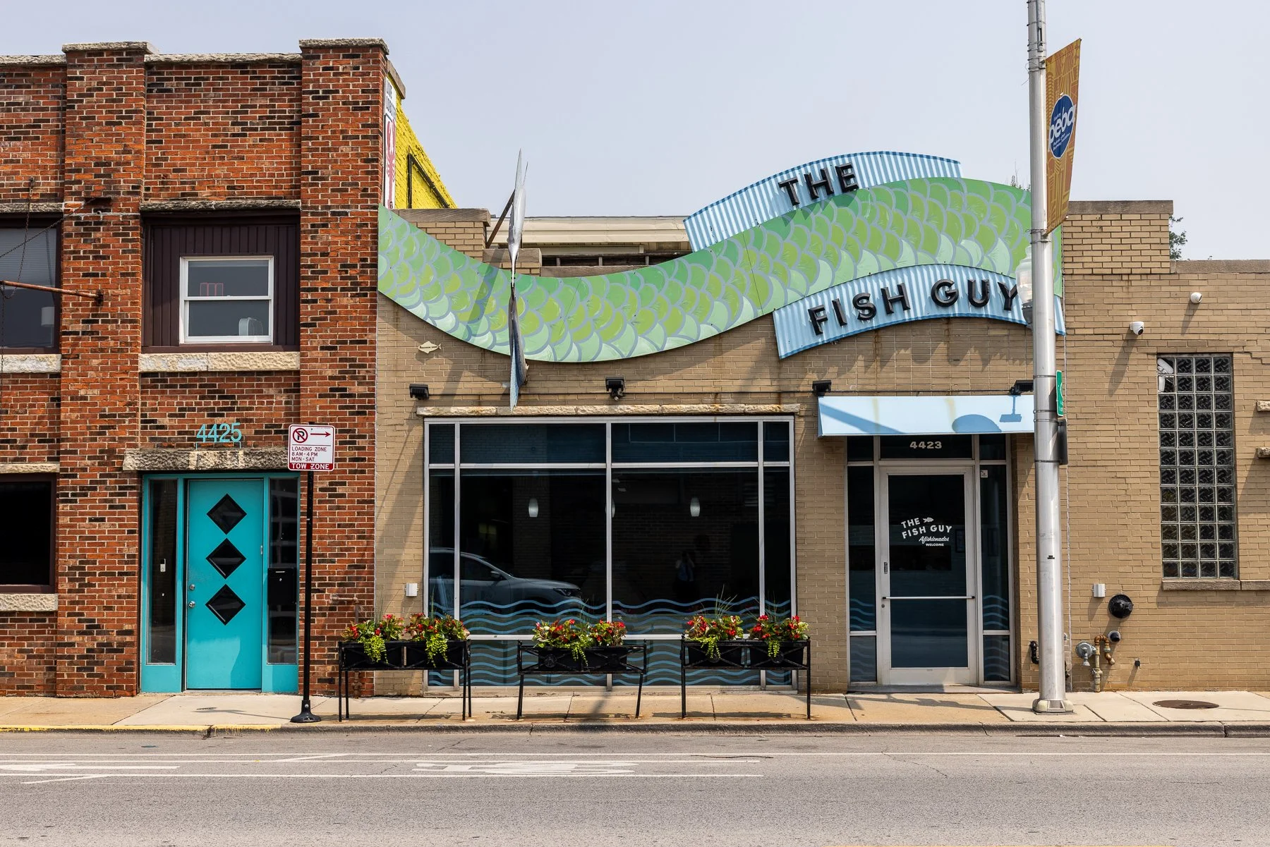
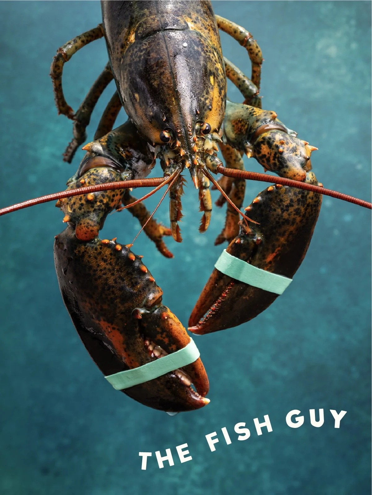
After plenty of conversation, we landed here: keep the essence of the story, reinvent everything else for the future. That started with a new look, rooted in the building’s history and the original quirky sign—bold type, a marlin, and an old-Chicago vibe.
The new brand identity communicates the new vision for the company: a commitment to delivering fish that’s fresher, more sustainabe, and simply better than before – with the right people in serving you everyday.
The Fish Guy is now fishier than ever—and we wouldn’t have it any other way.
-
Positioning
Branding
Tone of Voice
Copywriting
Signage Design
Website Design
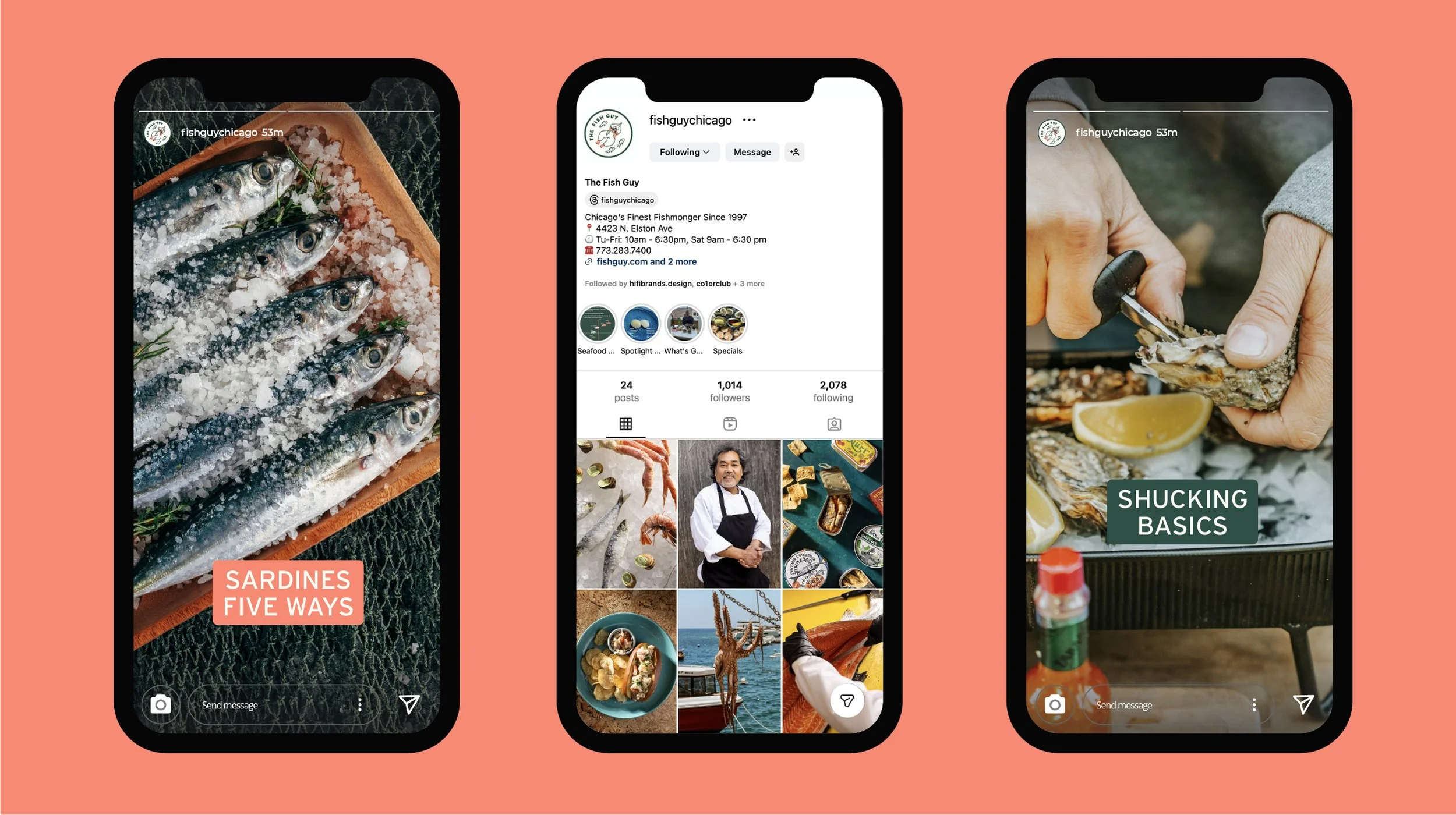
Social Media
Photography Art Direction
Staff Fit
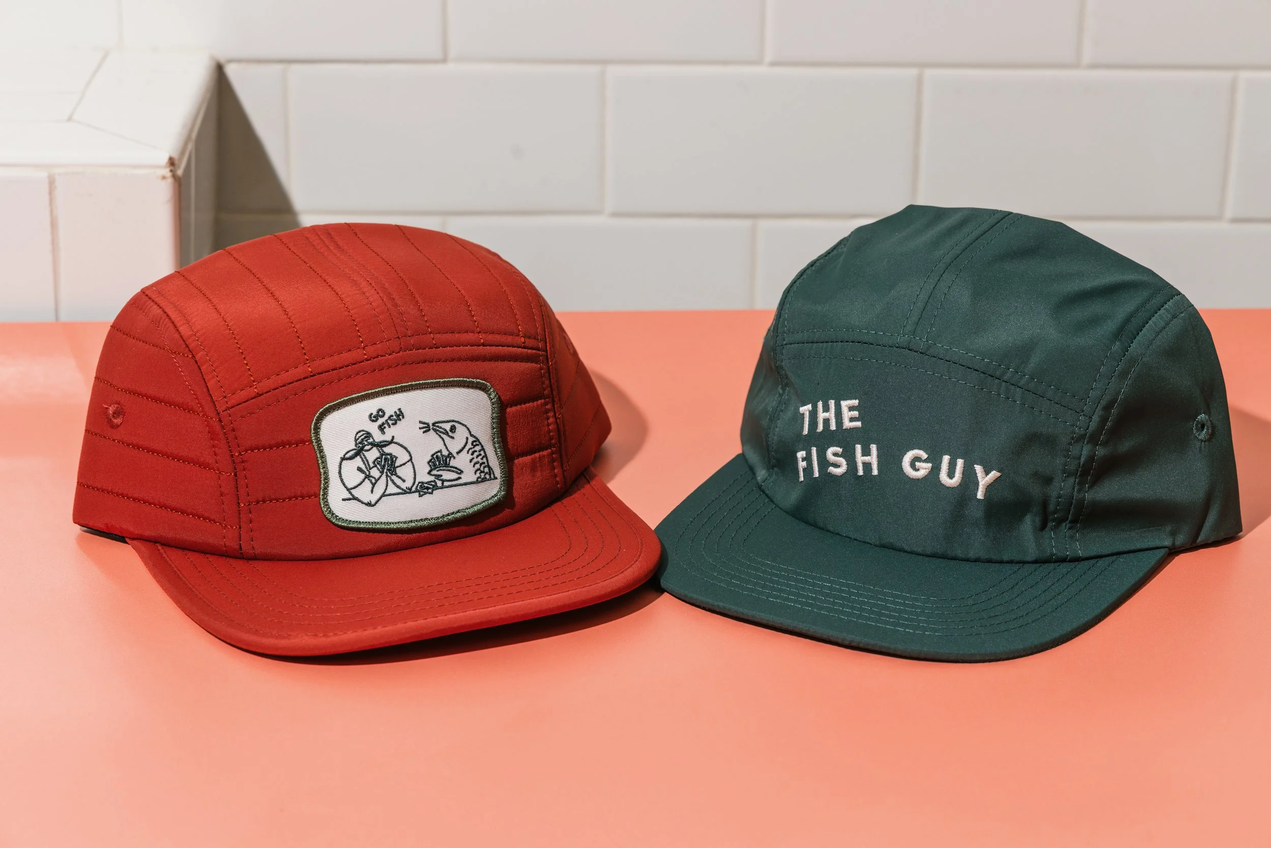
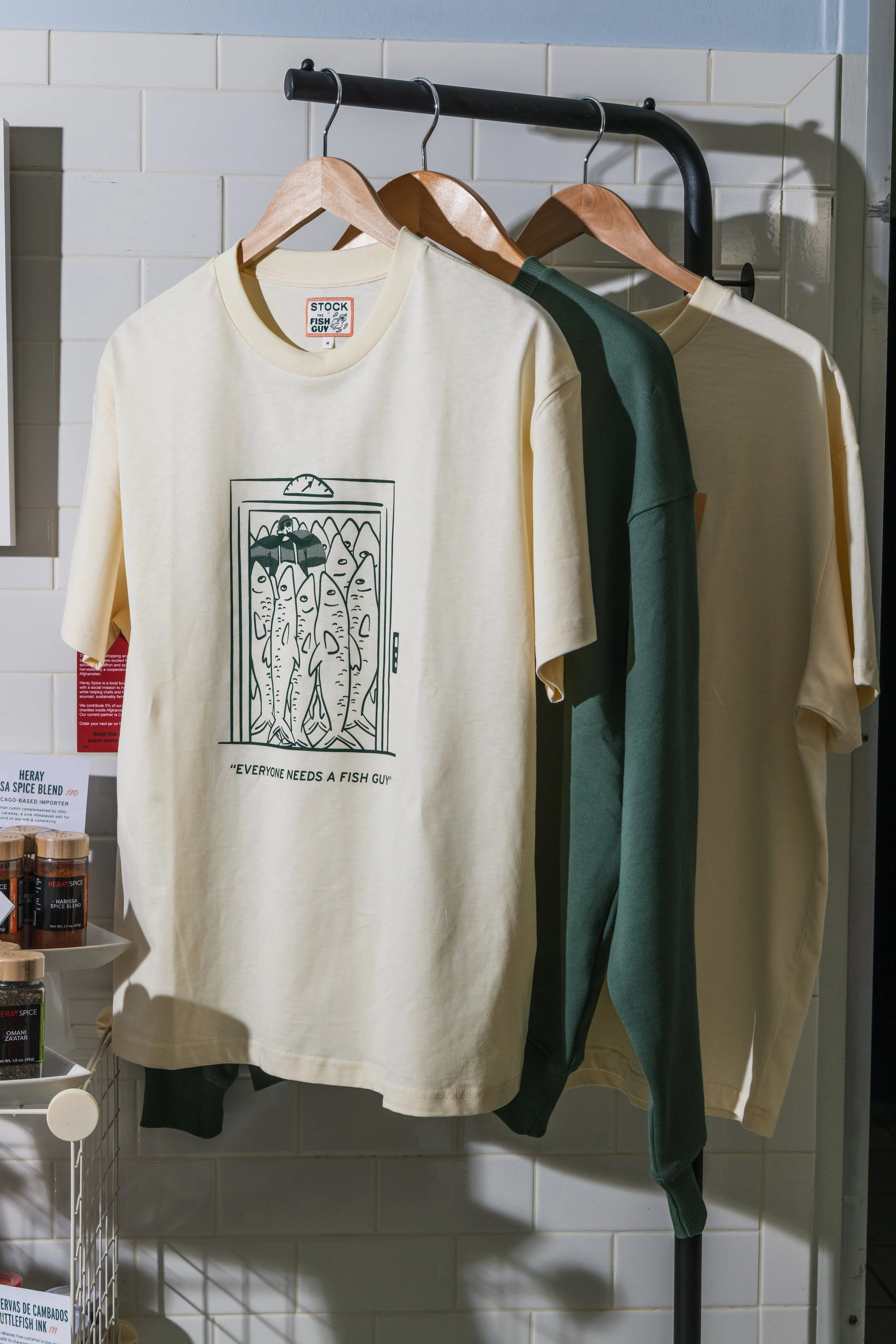
Collateral
Illustrations
-
The Fish Guy has long operated at the intersection of wholesale authority and neighborhood charm. The challenge is to evolve the brand in a way that honors its legacy, the trusted fishmonger, the daily chalkboard specials, the deep sourcing relationships, while elevating perception to match the quality of the product and clientele it serves.
The brand must speak fluently to two audiences at once: the home cook popping in for salmon on a Tuesday, and the Michelin-caliber chef sourcing pristine uni. It needs to feel warm, knowledgeable, and human, but also disciplined, credible, and uncompromising about quality.
-
Chicagoans want a place that feels like theirs, but still worth going out of their way for.
They crave the trust and familiarity of a neighborhood institution, paired with the standards and cultural energy of a true food destination. Quality is expected. Transparency matters. Experience counts.
The Fish Guy already holds the credibility. The opportunity is to express that expertise in a way that feels welcoming and aspirational at the same time. Not just a place to buy fish, but a place that reflects how Chicago wants to cook, gather, and eat.
-
The Fish Guy identity now carries a buoyant voice and a strong sense of self. It shows up with presence and clarity, elevating the brand while preserving the grit, warmth, and credibility that made it a Chicago staple in the first place.
-
Creative Direction - Allison Rosenwinkel
Design & Illustration - Sarah Hinman
Photography - Lucy Hewett
Web Development - Week of the Website
Sign Painting - Stephen Monkemeier
Custom Apparel - Stock MFG
“Our goal was to protect what people already love about The Fish Guy while elevating how the brand shows up. The strategy was simple… honor the heritage, reflect Chicago’s hardworking spirit, and create a system that could speak to both neighborhood regulars and top-tier chefs with equal confidence.”
— Allison Rosenwinkel, Co-Founder, HiFi Brands

The Brand Identity
We weren’t chasing newness. We were reclaiming what made it great.
The equity was already there. Locals knew the shop. And at the center of that recognition was the grandfathered-in, old school exterior sign that had become part of the neighborhood fabric.
The typography for the new logo was directly traced from that sign, capturing its quirks, weight, and proportions. From there, we built flexibility into the configuration of the letters so the mark could adapt across applications while staying rooted in its original form.
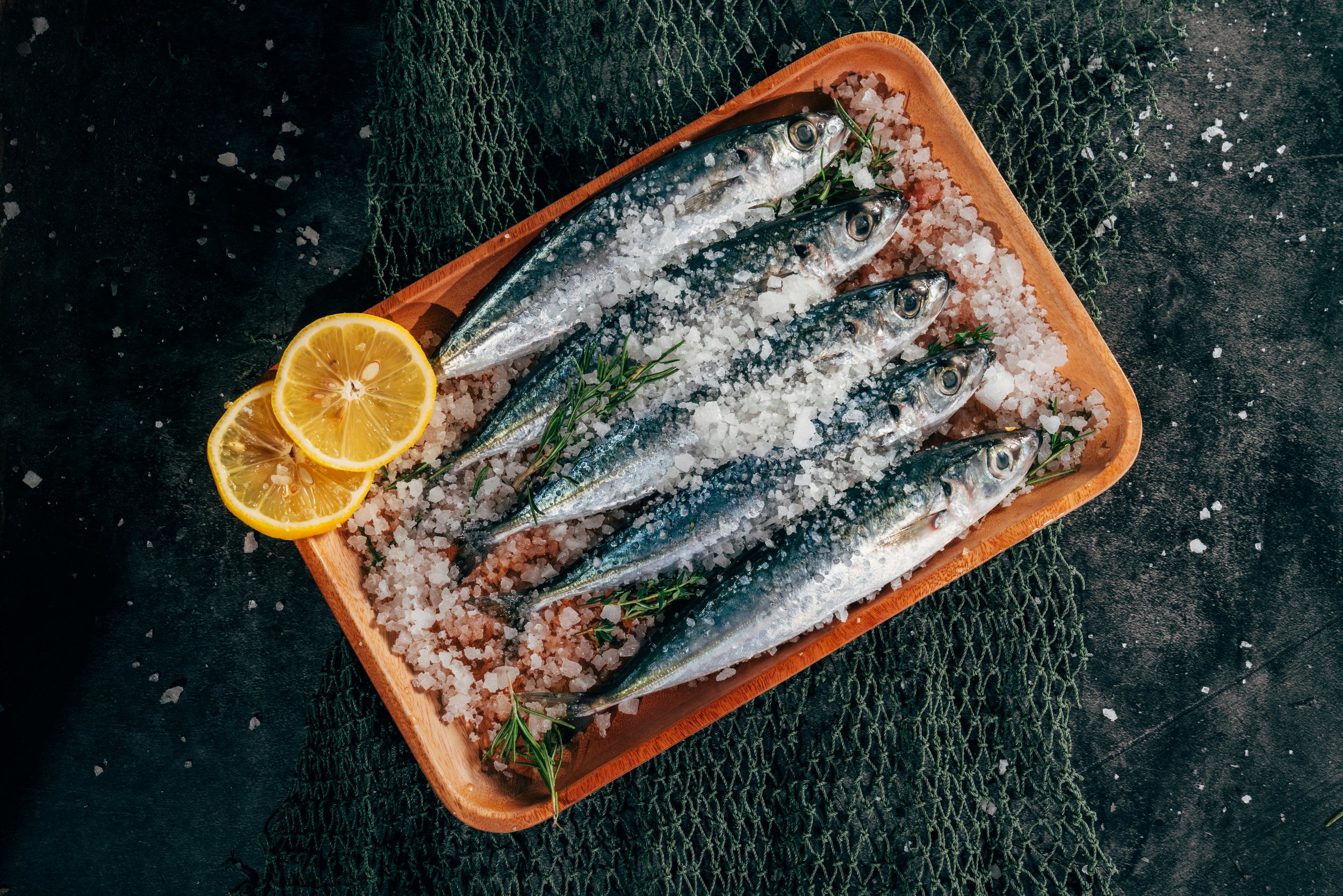
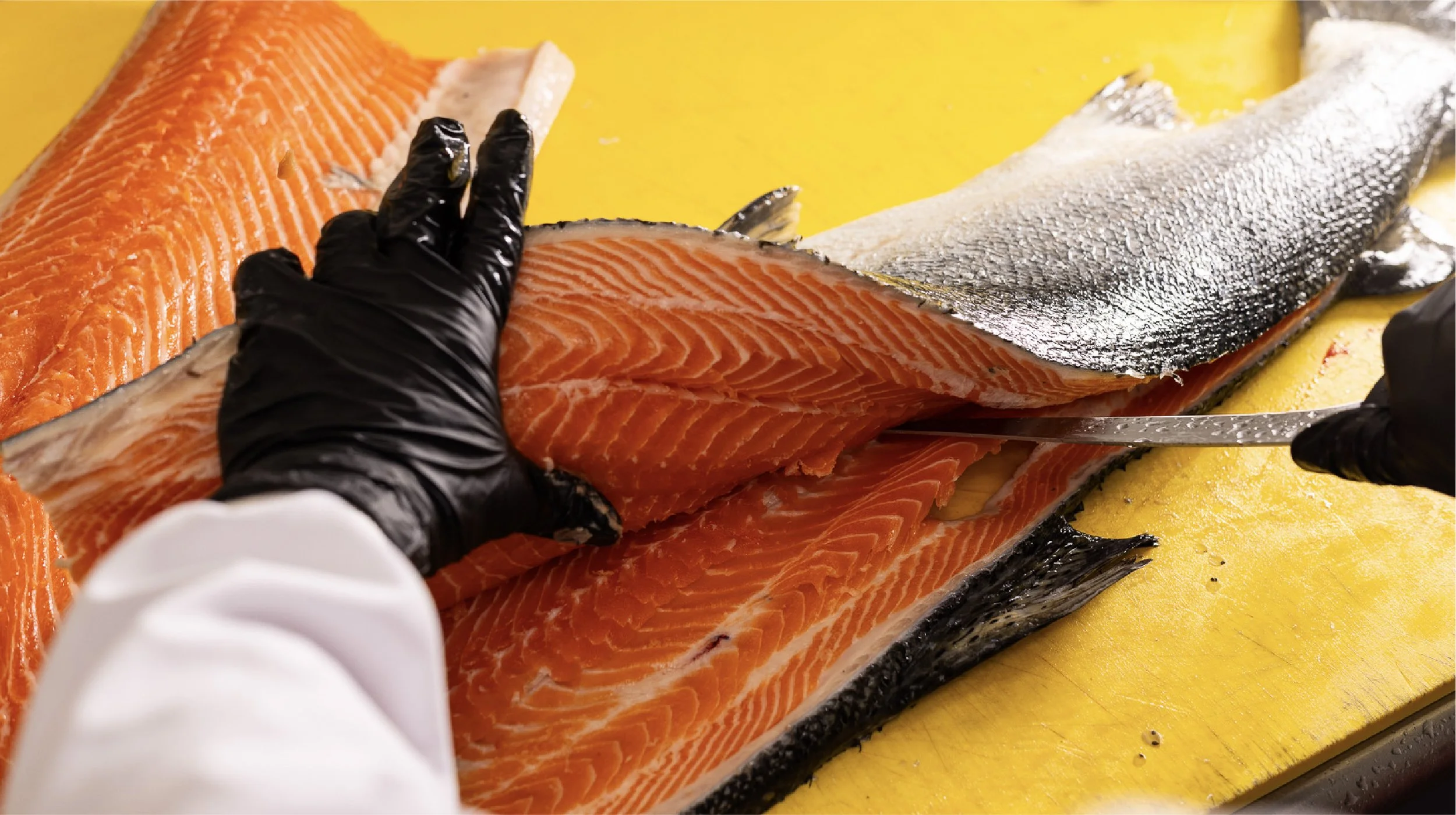
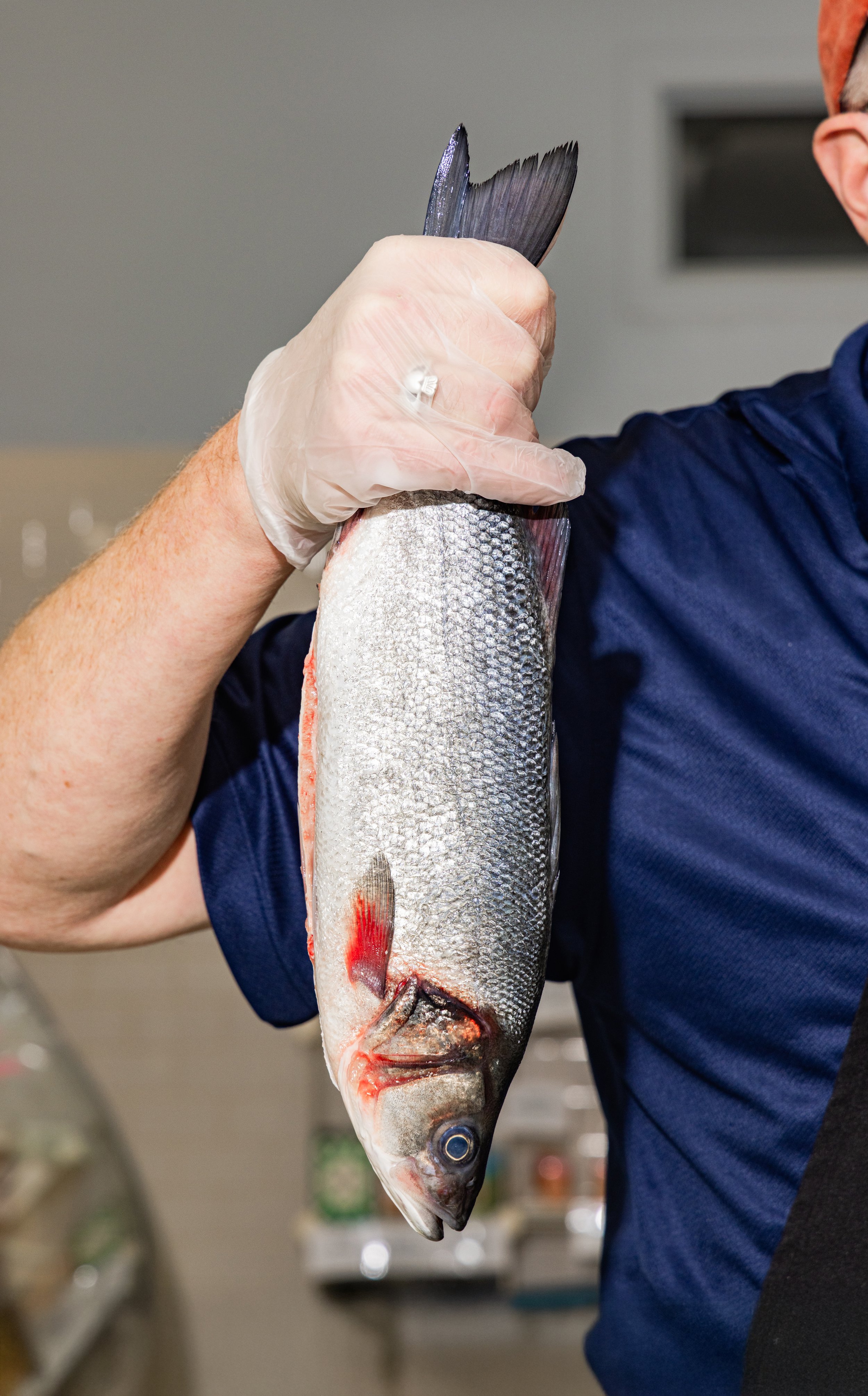
We paired it with supporting typography that carried an old-school fish market sensibility and introduced a fresh illustration style to inject personality and tone. The photography style used bright, saturated color and a tactile approach to communicate freshness and quality.


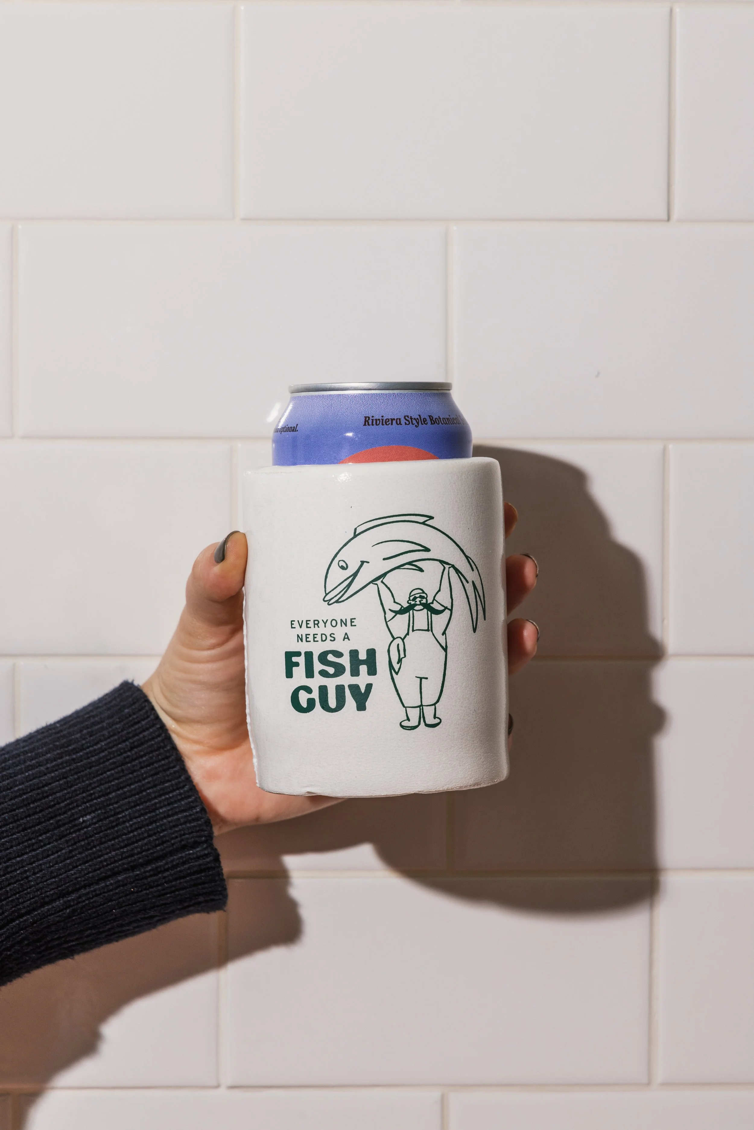
Building the Brand’s Iconic Illustration Style
A core element of the rebrand was personifying the fish “guy” in a way that stayed intentionally nondescript. He could be the founder, the fishmonger behind the counter, or just a guy who really, really loves fish. The ambiguity made him flexible and timeless, allowing his identity to evolve without feeling boxed in.
The illustration style draws from classic fish market graphics, old menu boards, and maritime ephemera, but it avoids slipping into nostalgia for nostalgia’s sake. There is a subtle fish camp sensibility woven throughout. The Fish Guy appears in playful, slightly absurd scenarios with the seafood as if they are his inner circle. Packed into an elevator with sardines. Playing cards with an oyster. These vignettes create warmth and memorability while staying disciplined in execution.
Strategically, the illustrations help soften the brand’s authority without diluting it. They balance the premium quality of the product with humor and humanity, reinforcing that this is serious seafood delivered by people who do not take themselves too seriously. The result is a Chicago seafood brand identity that feels rooted, expressive, and distinctly its own.
Our goal was to build something rooted in the shop’s heritage and Chicago’s industrial, hardworking spirit. Confident, quirky, and heartwarming.


“We wanted the Fish Guy to feel like someone you’d want to hang out with and can count on.”
— Sarah Hinman, Senior Designer, HiFi Brands


Ready to elevate your restaurant concept?
Restaurants live or die by perception, atmosphere, repeat visits, and emotional connection — which means the brand has to work just as hard as the food does.