Dimmi Dimmi: A New Red Sauce Classic for Lincoln Park
HiFi helps Dimmi Dimmi become Lincoln Park’s new go-to Italian.
When a neighborhood loses a long-standing restaurant, there’s always a gap to fill — not just in cuisine, but in culture. At the corner of Armitage and Seminary, the space once known as Tarantino’s carried nearly a century of Italian dining history.
When the team behind Dimmi Dimmi set out to bring it back to life, they weren’t looking to reinvent the wheel. They wanted to create a place that felt like it had always belonged — familiar, comfortable, and timeless, with just the right amount of edge.
That’s where HiFi came in.
A Brand That Feels Like It’s Always Been There
Our work began with a simple question: what makes a neighborhood spot feel like home?
From naming and brand voice to signage and storytelling, every decision was guided by one north star — to become Lincoln Park’s “everyday” Italian. The kind of place you return to again and again, whether it’s dinner with friends, Sunday family night, or a solo pizza run on your way home.
Familiar, Not Fussy
Red sauce Italian is comfort food at its core: hearty, unfussy, and meant to be shared. But “everyday” in Lincoln Park doesn’t mean predictable.
Dimmi Dimmi needed personality, a look and feel that was artful but approachable, nostalgic but fresh. Together, we built a brand rooted in three key ideas:
Eclectic & evolving – a place that feels alive and never stagnant
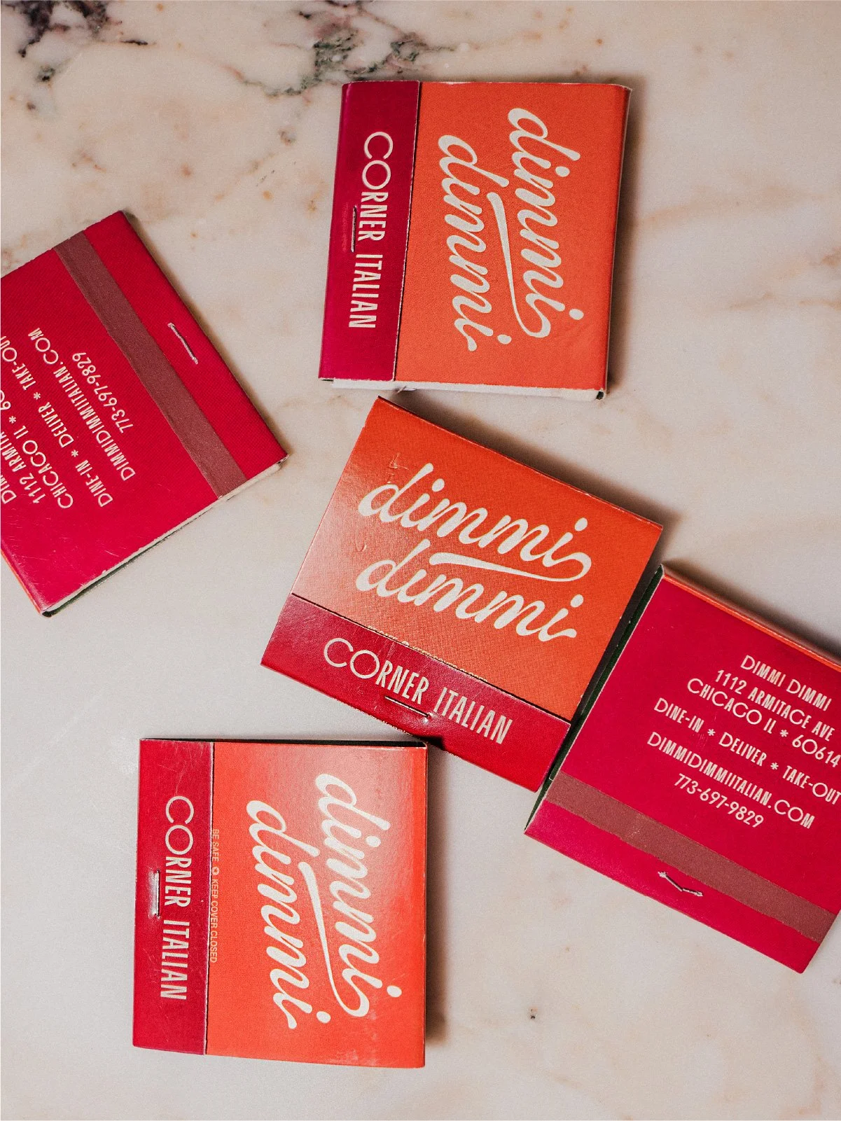
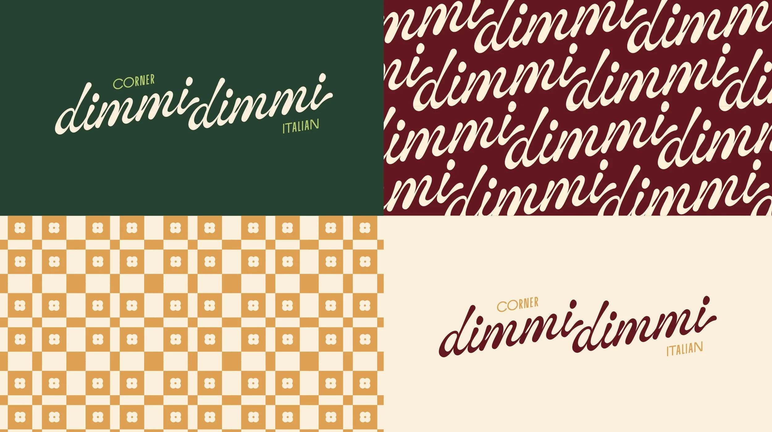
Artful & graphic – pulling cues from vintage Italian signage, pasta packaging, and 1960s supper clubs
Effortlessly stylish – confident design that feels intentional, not overworked
A Visual Story Layered with Memory
Dimmi Dimmi’s visual world takes its cues from the textures of memory — sun-faded storefronts, vintage wallpaper, and old family photos that feel both lived-in and loved.
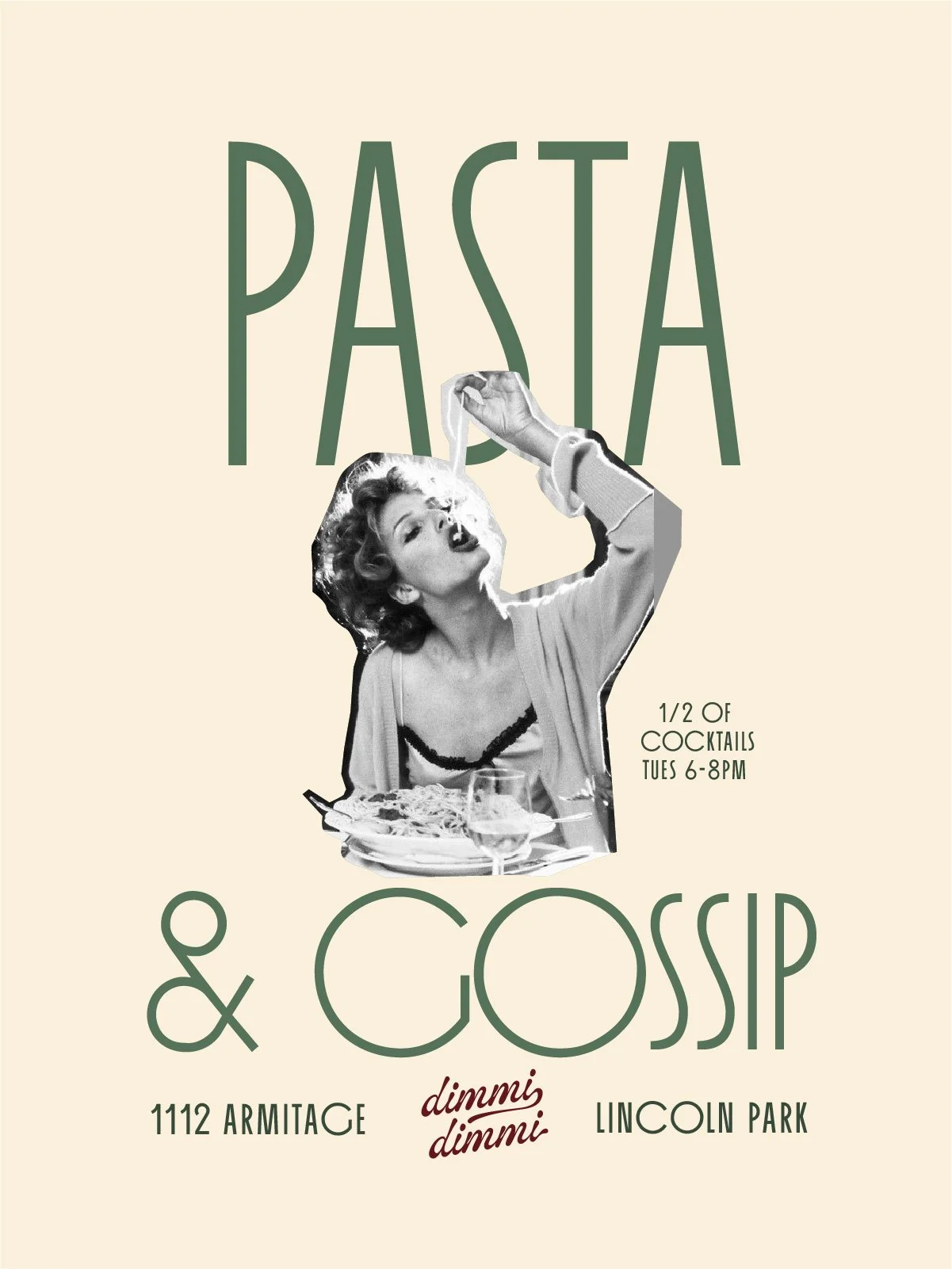
The color palette mixes warmth and depth, grounded in earth tones and softened with subtle pastels. Typography leans expressive and bold, borrowing from 1960s Italian packaging for a look that feels both direct and familiar. It’s a layered, intentional design system that still leaves room to breathe.
The Energy of a Shared Table
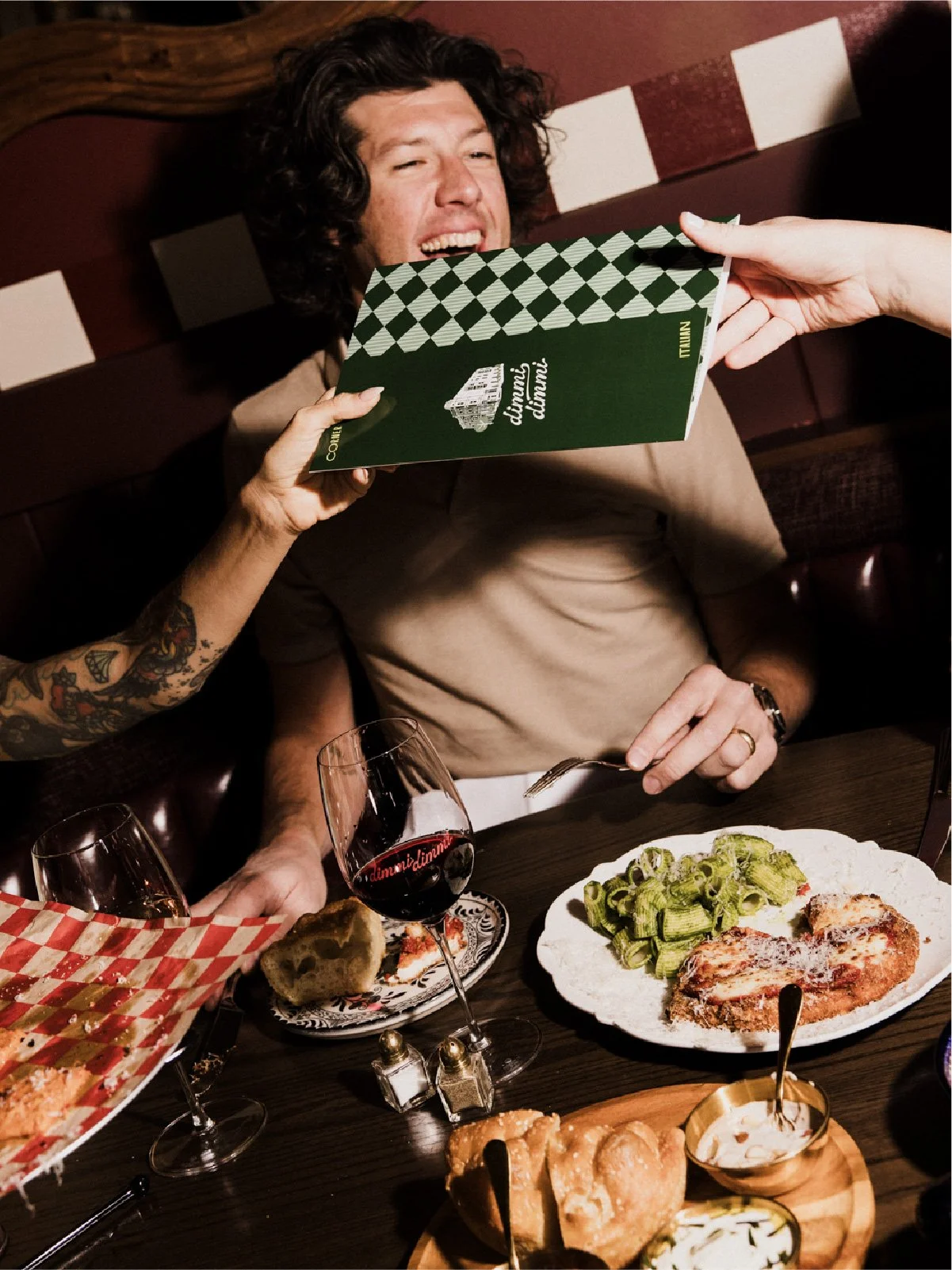
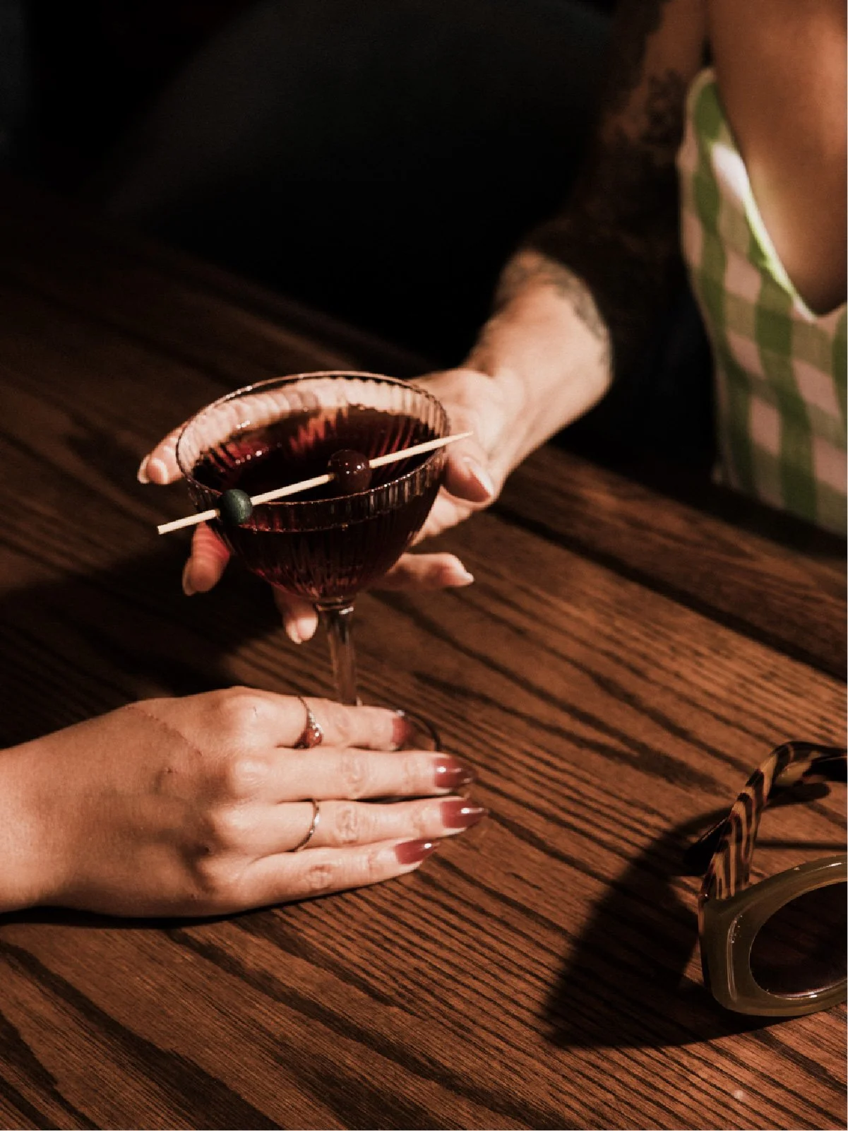
Photography and copywriting carry the same sense of unpolished charm. Food is styled in bold patterns, captured with hard light and flash for grit, vibrancy, and movement, like memories caught mid-laughter.
The voice is confident, conversational, and a little cheeky. Dimmi Dimmi speaks like a friend who knows good food and isn’t afraid to talk with their hands. It doesn’t overthink or oversell. It simply invites you in.
A New Everyday Spot
Dimmi Dimmi isn’t chasing buzz or reservations — it’s here to stay. A neighborhood staple in the making, equal parts style and substance.
For Lincoln Park, it’s the return of a beloved corner. For us, it’s proof that the best design doesn’t shout, it simply feels right.


